Layton R blog
  • Contact
  • About
  1. Data Stories
  • r-bloggers
  • stackoverflow
  • data.table
  • ggplot2
  • happy git
Categories
All (14)
R (14)
SE/NSE (1)
chart design (10)
data storytelling (8)
dplyr (1)
engineering education (5)
engineering notation (2)
ggplot2 (3)
magick (1)
midfieldr (1)
quarto (2)
rmarkdown (2)
scientific notation (2)
units (2)
visual lies (1)

Data Stories

An occasional blog about visual rhetoric and chart design in R.
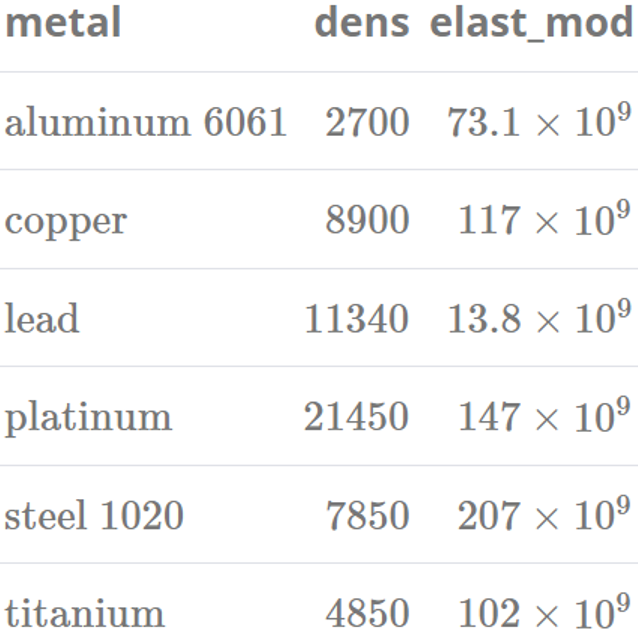
A subtle flaw in pull()

R
dplyr
SE/NSE
Demonstrating a subtle scoping flaw in dplyr::pull() and providing a menu of reliable workarounds.
2024-08-01
Richard Layton

formatdown v0.1.4

R
engineering notation
scientific notation
units
rmarkdown
quarto
New functionality for formatting power-of-ten notation in R markdown or Quarto markdown documents.
2024-05-20
Richard Layton

midfieldr v1.0.1

R
engineering education
midfieldr
Provides tools and methods for studying undergraduate student-level records from the MIDFIELD database.
2023-07-09
Richard Layton

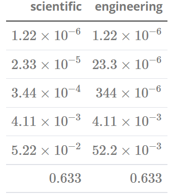
Introducing formatdown

R
engineering notation
scientific notation
units
rmarkdown
quarto
Provides powers-of-ten formatting for a numerical vector or data frame column when creating documents in rmarkdown or quarto markdown.
2022-11-21
Richard Layton

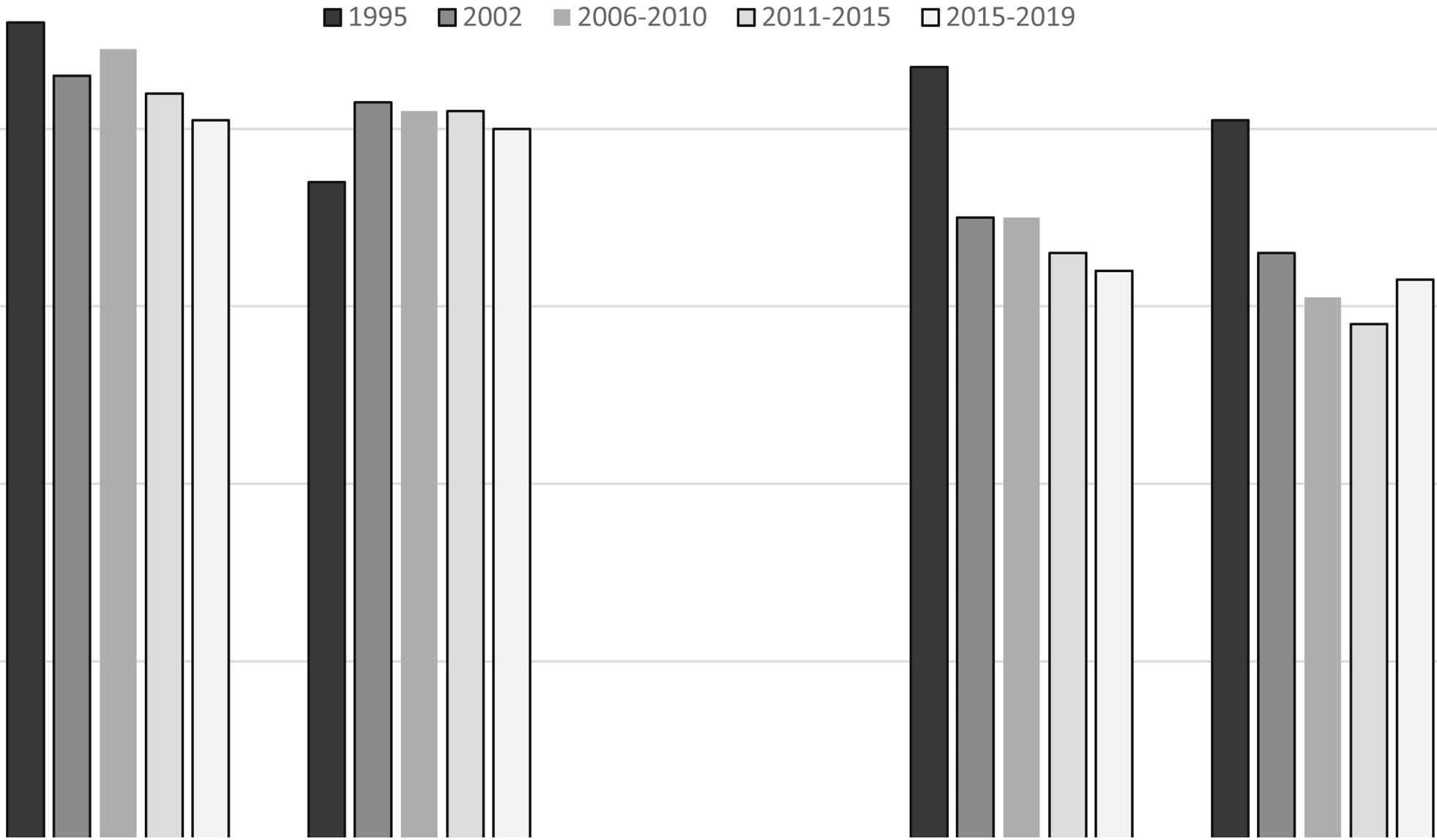
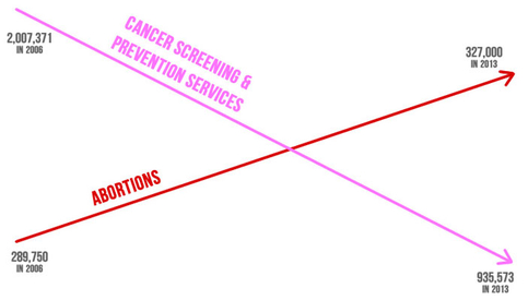
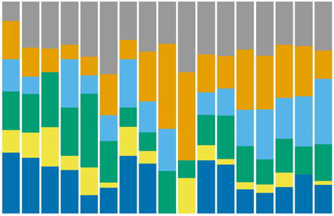
Multiple studies, one chart

R
data storytelling
ggplot2
chart design
Combining the results of studies with different time spans in a single chart when changes over time are the story.
2022-09-05
Richard Layton

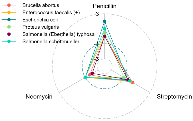
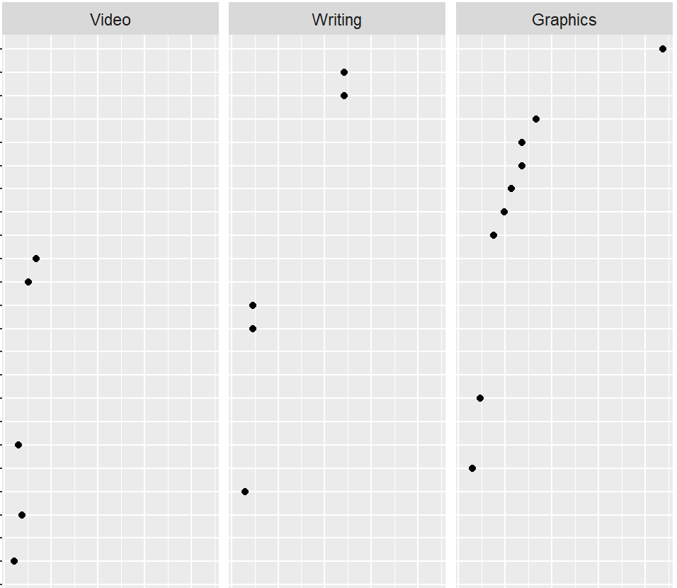
Spiders, facets, and dots, oh my!

R
ggplot2
data storytelling
magick
chart design
A case study comparing the effectiveness of a radar chart to a faceted dot chart.
2022-08-21
Richard Layton

Another case for redesigning dual axis charts

R
data storytelling
chart design
An example of replacing a dual axis chart with alternatives better suited to drawing inferences about the data.
2022-06-06
Richard Layton

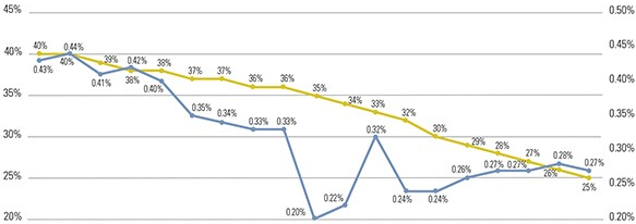
Revisiting a lying chart

R
data storytelling
visual lies
chart design
Revisiting the rhetoric of a deliberate visual lie, updating the data set, and providing data and code for reproducibility.
2022-05-27
Richard Layton

Facets that are not small multiples

R
ggplot2
chart design
Using the scales and space arguments of facet_grid() to manage panel heights of faceted charts when categories are not independent.
2022-03-09
Richard Layton

Survey data I/O with likert

R
chart design
How to prepare different forms of Likert-style survey data for the R likert package and edit the results to create 100% stacked-bar charts.
2022-02-13
Richard Layton

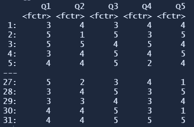
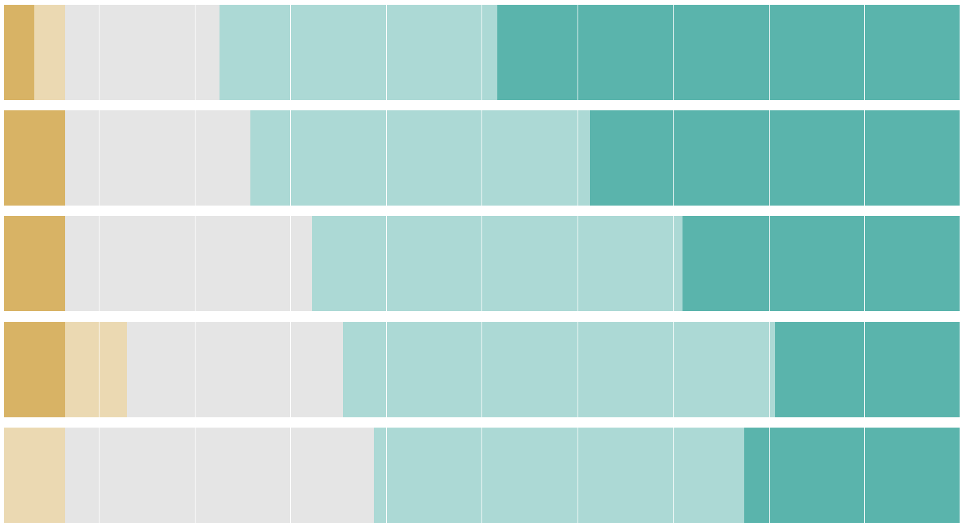
Survey data chart designs

R
data storytelling
engineering education
chart design
Comparing chart designs for displaying Likert-style survey results and concluding that the 100% stacked-bar chart is the most effective.
2022-02-12
Richard Layton

Plot the variable of interest

R
data storytelling
engineering education
chart design
A chart best serves its rhetorical purpose by directly illustrating the variables of interest discussed in the text.
2022-02-03
Richard Layton

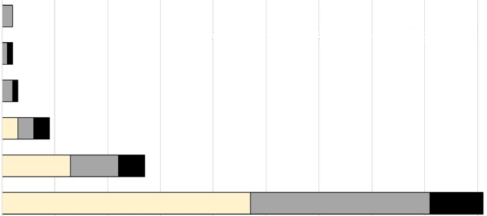
Stacked-bar alternatives

R
data storytelling
engineering education
chart design
Redesigning two stacked bar charts to better convey the stories in their data.
2022-01-14
Richard Layton

The missing relation

R
data storytelling
engineering education
chart design
Redesigning a grouped-bar chart and including missing data to reveal an important change to the story in the data.
2015-07-20
Richard Layton
No matching items

Software credits

  • R and RStudio
  • data.table for manipulating data
  • ggplot2 for data graphics
  • ggpubfigs for color vision deficient inclusive palettes
  • quarto for constructing this blog
 
  • License

  • Report an issue