class: right .left-column[ <img src="img/test-composite.png"> ] # Expanding your graphical repertoire ### Variables + Argument → Design <br> <br> Richard Layton 2022-02-14 <br> <br> <https://graphdr.github.io/data-stories/> <https://github.com/graphdr> <a href="mailto:graphdoctor@gmail.com">graphdoctor@gmail.com</a> --- class: left .left-column[ <img src="img/test-composite.png"> ] #### `\(\quad\)` #### `\(\quad\)` Comparing data #### `\(\quad\)` <br> #### `\(\quad\)` Revealing correlations #### `\(\quad\)` <br> #### `\(\quad\)` Showing evolution #### `\(\quad\)` <br> #### `\(\quad\)` Displaying distributions <div class="my-footer"> <span> Optimal design categories from: Jean-luc Doumont (2009) <em>Trees, Maps and Theorems</em>, Principiae, p. 133. </span> </div> --- class:inverse, center, middle # Comparing data --- class: left # Dot chart Good substitute for pie charts or bar charts. .pull-left[ <!-- --> ] .pull-right[ <br> <table class="table" style="font-size: 18px; float: left; margin-right: 10px;"> <thead><tr><th style="border-bottom:hidden;padding-bottom:0; padding-left:3px;padding-right:3px;text-align: center; " colspan="2"><div style="border-bottom: 1px solid #ddd; padding-bottom: 5px; ">Variables</div></th></tr></thead> <tbody> <tr> <td style="text-align:left;background-color: white !important;"> infant mortality </td> <td style="text-align:left;background-color: white !important;"> quantitative </td> </tr> <tr> <td style="text-align:left;background-color: white !important;"> age of mother </td> <td style="text-align:left;background-color: white !important;"> categorical, ordinal, 6 levels </td> </tr> </tbody> </table> <br> <br> <br> - category (age) levels on rows - quantities along common horizontal scale ] <div class="my-footer"> <span>Data source: US Centers for Disease Control and Prevention <a href="https://wonder.cdc.gov/lbd-current.html">CDC WONDER Linked Birth / Infant Death Records</a></span> </div> --- class: left # Dot chart, superposed Subset by a second category. .pull-left[ <!-- --> ] .pull-right[ <br> <table class="table" style="font-size: 18px; float: left; margin-right: 10px;"> <thead><tr><th style="border-bottom:hidden;padding-bottom:0; padding-left:3px;padding-right:3px;text-align: center; " colspan="2"><div style="border-bottom: 1px solid #ddd; padding-bottom: 5px; ">Variables</div></th></tr></thead> <tbody> <tr> <td style="text-align:left;background-color: white !important;"> infant mortality </td> <td style="text-align:left;background-color: white !important;"> quantitative </td> </tr> <tr> <td style="text-align:left;background-color: white !important;"> age of mother </td> <td style="text-align:left;background-color: white !important;"> categorical, ordinal, 6 levels </td> </tr> <tr> <td style="text-align:left;background-color: white !important;"> race/ethnicity </td> <td style="text-align:left;background-color: white !important;"> categorical, nominal, 2 levels </td> </tr> </tbody> </table> <br> <br> <br> - category 1 (age) levels on rows - category 2 (race/ethnicity) color-coded - quantities along common horizontal scale ] <div class="my-footer"> <span>Data source: US Centers for Disease Control and Prevention <a href="https://wonder.cdc.gov/lbd-current.html">CDC WONDER Linked Birth / Infant Death Records</a></span> </div> --- class: left # Multiway dot chart Same data. Change superposed design to a faceted design. .pull-left[ <!-- --> ] .pull-right[ <br> <table class="table" style="font-size: 18px; float: left; margin-right: 10px;"> <thead><tr><th style="border-bottom:hidden;padding-bottom:0; padding-left:3px;padding-right:3px;text-align: center; " colspan="2"><div style="border-bottom: 1px solid #ddd; padding-bottom: 5px; ">Variables</div></th></tr></thead> <tbody> <tr> <td style="text-align:left;background-color: white !important;"> infant mortality </td> <td style="text-align:left;background-color: white !important;"> quantitative </td> </tr> <tr> <td style="text-align:left;background-color: white !important;"> age of mother </td> <td style="text-align:left;background-color: white !important;"> categorical, ordinal, 6 levels </td> </tr> <tr> <td style="text-align:left;background-color: white !important;"> race/ethnicity </td> <td style="text-align:left;background-color: white !important;"> categorical, nominal, 2 levels </td> </tr> </tbody> </table> <br> <br> <br> - category 1 (age) levels on rows - category 2 (race/ethnicity) levels on panels - quantities along identical scales ] <div class="my-footer"> <span>Data source: US Centers for Disease Control and Prevention <a href="https://wonder.cdc.gov/lbd-current.html">CDC WONDER Linked Birth / Infant Death Records</a></span> </div> --- class: left # Multiway dot chart Changing one category changes the number of facets. <!-- --> .left[ <table class="table" style="font-size: 18px; float: left; margin-right: 10px;"> <thead><tr><th style="border-bottom:hidden;padding-bottom:0; padding-left:3px;padding-right:3px;text-align: center; " colspan="2"><div style="border-bottom: 1px solid #ddd; padding-bottom: 5px; ">Variables</div></th></tr></thead> <tbody> <tr> <td style="text-align:left;background-color: white !important;"> infant mortality </td> <td style="text-align:left;background-color: white !important;"> quantitative </td> </tr> <tr> <td style="text-align:left;background-color: white !important;"> age of mother </td> <td style="text-align:left;background-color: white !important;"> categorical, ordinal, 6 levels </td> </tr> <tr> <td style="text-align:left;background-color: white !important;"> US region </td> <td style="text-align:left;background-color: white !important;"> categorical, nominal, 4 levels </td> </tr> </tbody> </table> ].pull-right[ - Rows ordered by age. - Facets ordered by median value. ] <div class="my-footer"> <span>Data source: US Centers for Disease Control and Prevention <a href="https://wonder.cdc.gov/lbd-current.html">CDC WONDER Linked Birth / Infant Death Records</a></span> </div> --- class: left # Multiway dot chart Same data. Switching facets and rows yields a different view of the data. <!-- --> .left[ <table class="table" style="font-size: 18px; float: left; margin-right: 10px;"> <thead><tr><th style="border-bottom:hidden;padding-bottom:0; padding-left:3px;padding-right:3px;text-align: center; " colspan="2"><div style="border-bottom: 1px solid #ddd; padding-bottom: 5px; ">Variables</div></th></tr></thead> <tbody> <tr> <td style="text-align:left;background-color: white !important;"> infant mortality </td> <td style="text-align:left;background-color: white !important;"> quantitative </td> </tr> <tr> <td style="text-align:left;background-color: white !important;"> age of mother </td> <td style="text-align:left;background-color: white !important;"> categorical, ordinal, 6 levels </td> </tr> <tr> <td style="text-align:left;background-color: white !important;"> US region </td> <td style="text-align:left;background-color: white !important;"> categorical, nominal, 4 levels </td> </tr> </tbody> </table> ] .pull-right[ - Rows ordered by the median value. - Facets ordered by age. ] <div class="my-footer"> <span>Data source: US Centers for Disease Control and Prevention <a href="https://wonder.cdc.gov/lbd-current.html">CDC WONDER Linked Birth / Infant Death Records</a></span> </div> --- class: left # Multiway dot chart, superposed Subset further by superposing a new category—for a total of 4 variables. <!-- --> .left[ <table class="table" style="font-size: 18px; float: left; margin-right: 10px;"> <thead><tr><th style="border-bottom:hidden;padding-bottom:0; padding-left:3px;padding-right:3px;text-align: center; " colspan="2"><div style="border-bottom: 1px solid #ddd; padding-bottom: 5px; ">Variables</div></th></tr></thead> <tbody> <tr> <td style="text-align:left;background-color: white !important;"> infant mortality </td> <td style="text-align:left;background-color: white !important;"> quantitative </td> </tr> <tr> <td style="text-align:left;background-color: white !important;"> age of mother </td> <td style="text-align:left;background-color: white !important;"> categorical, ordinal, 6 levels </td> </tr> <tr> <td style="text-align:left;background-color: white !important;"> US region </td> <td style="text-align:left;background-color: white !important;"> categorical, nominal, 4 levels </td> </tr> <tr> <td style="text-align:left;background-color: white !important;"> race/ethnicity </td> <td style="text-align:left;background-color: white !important;"> categorical, nominal, 2 levels </td> </tr> </tbody> </table> ] .pull-right[ - Direct labeling eliminates the legend. - Color palette safe for color-vision-deficient viewers. ] <div class="my-footer"> <span>Data source: US Centers for Disease Control and Prevention <a href="https://wonder.cdc.gov/lbd-current.html">CDC WONDER Linked Birth / Infant Death Records</a></span> </div> --- class:inverse, center, middle # Revealing correlations --- class: left # Scatterplot Designed to reveal correlations between two quantitative variables. .pull-left[ <!-- --> ] .pull-right[ <br> <table class="table" style="font-size: 18px; float: left; margin-right: 10px;"> <thead><tr><th style="border-bottom:hidden;padding-bottom:0; padding-left:3px;padding-right:3px;text-align: center; " colspan="2"><div style="border-bottom: 1px solid #ddd; padding-bottom: 5px; ">Variables</div></th></tr></thead> <tbody> <tr> <td style="text-align:left;background-color: white !important;"> life expectancy </td> <td style="text-align:left;background-color: white !important;"> quantitative </td> </tr> <tr> <td style="text-align:left;background-color: white !important;"> GDP per capita </td> <td style="text-align:left;background-color: white !important;"> quantitative </td> </tr> </tbody> </table> <br> <br> <br> "International dollar" is a hypothetical currency with the same *purchasing power parity* (PPP) as constant US dollars (here, the basis is 2011). In thousands: "kIntl$" ] <div class="my-footer"> <span>Data source: <a href="https://www.gapminder.org/data/">Gapminder Foundation</a></span> </div> --- class: left # Scatterplot, superposed Subset by a categorical variable, "Global region". .pull-left[ <!-- --> ] .pull-right[ <br> <table class="table" style="font-size: 18px; float: left; margin-right: 10px;"> <thead><tr><th style="border-bottom:hidden;padding-bottom:0; padding-left:3px;padding-right:3px;text-align: center; " colspan="2"><div style="border-bottom: 1px solid #ddd; padding-bottom: 5px; ">Variables</div></th></tr></thead> <tbody> <tr> <td style="text-align:left;background-color: white !important;"> life expectancy </td> <td style="text-align:left;background-color: white !important;"> quantitative </td> </tr> <tr> <td style="text-align:left;background-color: white !important;"> GDP per capita </td> <td style="text-align:left;background-color: white !important;"> quantitative </td> </tr> <tr> <td style="text-align:left;background-color: white !important;"> global region </td> <td style="text-align:left;background-color: white !important;"> categorical, nominal, 4 levels </td> </tr> </tbody> </table> <br> <br> <br> - Works best when clusters of subsets are distinct. - Requires a legend if data cannot be directly labeled. ] <div class="my-footer"> <span>Data source: <a href="https://www.gapminder.org/data/">Gapminder Foundation</a></span> </div> --- class: left # Scatterplot, faceted Same three variables with "Global region" levels in 4 facets. <!-- --> - A legend and color are no longer needed. - Facets are ordered by median life expectancy in "graph order." <div class="my-footer"> <span>Data source: <a href="https://www.gapminder.org/data/">Gapminder Foundation</a></span> </div> --- class: left # Scatterplot, faceted Same three variables with "Global region" levels in 8 facets. <!-- --> <div class="my-footer"> <span>Data source: <a href="https://www.gapminder.org/data/">Gapminder Foundation</a></span> </div> --- class:inverse, center, middle # Showing evolution --- class: left # Time series A sequence of discrete-time data, often equally-spaced. Time is the independent variable. .pull-left[ <!-- --> ] .pull-right[ <br> <table class="table" style="font-size: 18px; float: left; margin-right: 10px;"> <thead><tr><th style="border-bottom:hidden;padding-bottom:0; padding-left:3px;padding-right:3px;text-align: center; " colspan="2"><div style="border-bottom: 1px solid #ddd; padding-bottom: 5px; ">Variables</div></th></tr></thead> <tbody> <tr> <td style="text-align:left;background-color: white !important;"> life expectancy </td> <td style="text-align:left;background-color: white !important;"> quantitative </td> </tr> <tr> <td style="text-align:left;background-color: white !important;"> year </td> <td style="text-align:left;background-color: white !important;"> categorical, ordinal </td> </tr> </tbody> </table> <br> <br> <br> - Discrete time (e.g., months or years) is a categorical, not quantitative, variable. - Dots connected by a dashed line if the points are far apart. ] <div class="my-footer"> <span>Data source: <a href="https://www.gapminder.org/data/">Gapminder Foundation</a></span> </div> --- class: left # Time series A sequence of discrete-time data, often equally-spaced. Time is the independent variable. .pull-left[ <!-- --> ] .pull-right[ <br> <table class="table" style="font-size: 18px; float: left; margin-right: 10px;"> <thead><tr><th style="border-bottom:hidden;padding-bottom:0; padding-left:3px;padding-right:3px;text-align: center; " colspan="2"><div style="border-bottom: 1px solid #ddd; padding-bottom: 5px; ">Variables</div></th></tr></thead> <tbody> <tr> <td style="text-align:left;background-color: white !important;"> life expectancy </td> <td style="text-align:left;background-color: white !important;"> quantitative </td> </tr> <tr> <td style="text-align:left;background-color: white !important;"> year </td> <td style="text-align:left;background-color: white !important;"> categorical, ordinal </td> </tr> </tbody> </table> <br> <br> <br> - If the dots are close together, ... ] <div class="my-footer"> <span>Data source: <a href="https://www.gapminder.org/data/">Gapminder Foundation</a></span> </div> --- class: left # Time series A sequence of discrete-time data, often equally-spaced. Time is the independent variable. .pull-left[ <!-- --> ] .pull-right[ <br> <table class="table" style="font-size: 18px; float: left; margin-right: 10px;"> <thead><tr><th style="border-bottom:hidden;padding-bottom:0; padding-left:3px;padding-right:3px;text-align: center; " colspan="2"><div style="border-bottom: 1px solid #ddd; padding-bottom: 5px; ">Variables</div></th></tr></thead> <tbody> <tr> <td style="text-align:left;background-color: white !important;"> life expectancy </td> <td style="text-align:left;background-color: white !important;"> quantitative </td> </tr> <tr> <td style="text-align:left;background-color: white !important;"> year </td> <td style="text-align:left;background-color: white !important;"> categorical, ordinal </td> </tr> </tbody> </table> <br> <br> <br> - If the dots are close together, ... a solid line is often used. ] <div class="my-footer"> <span>Data source: <a href="https://www.gapminder.org/data/">Gapminder Foundation</a></span> </div> --- class: left # Time series, superposed Time series conditioned by a categorical variable, with all lines in the same facet. .pull-left[ <!-- --> ] .pull-right[ <br> <table class="table" style="font-size: 18px; float: left; margin-right: 10px;"> <thead><tr><th style="border-bottom:hidden;padding-bottom:0; padding-left:3px;padding-right:3px;text-align: center; " colspan="2"><div style="border-bottom: 1px solid #ddd; padding-bottom: 5px; ">Variables</div></th></tr></thead> <tbody> <tr> <td style="text-align:left;background-color: white !important;"> life expectancy </td> <td style="text-align:left;background-color: white !important;"> quantitative </td> </tr> <tr> <td style="text-align:left;background-color: white !important;"> year </td> <td style="text-align:left;background-color: white !important;"> categorical, ordinal </td> </tr> <tr> <td style="text-align:left;background-color: white !important;"> country </td> <td style="text-align:left;background-color: white !important;"> categorical, nominal, 4 levels </td> </tr> </tbody> </table> <br> <br> <br> - Color is often used to distinguish superposed category levels. - Use colors safe for viewers with color-vision-deficiency - Labels eliminate the need for a legend. ] <div class="my-footer"> <span>Data source: <a href="https://www.gapminder.org/data/">Gapminder Foundation</a></span> </div> --- class: left # Time series, faceted <!-- --> .left-column[ Same data in faceted design. ] .right-column[ <table class="table" style="font-size: 18px; float: left; margin-right: 10px;"> <thead><tr><th style="border-bottom:hidden;padding-bottom:0; padding-left:3px;padding-right:3px;text-align: center; " colspan="2"><div style="border-bottom: 1px solid #ddd; padding-bottom: 5px; ">Variables</div></th></tr></thead> <tbody> <tr> <td style="text-align:left;background-color: white !important;"> life expectency </td> <td style="text-align:left;background-color: white !important;"> quantitative </td> </tr> <tr> <td style="text-align:left;background-color: white !important;"> year </td> <td style="text-align:left;background-color: white !important;"> categorical, ordinal </td> </tr> <tr> <td style="text-align:left;background-color: white !important;"> country </td> <td style="text-align:left;background-color: white !important;"> categorical, nominal, 4 levels </td> </tr> </tbody> </table> ] <div class="my-footer"> <span>Data source: <a href="https://www.gapminder.org/data/">Gapminder Foundation</a></span> </div> --- class: left # Connected scatterplot, faceted <!-- --> .left-column[ Scatterplot with adjacent points in time connected ] .right-column[ <table class="table" style="font-size: 18px; float: left; margin-right: 10px;"> <thead><tr><th style="border-bottom:hidden;padding-bottom:0; padding-left:3px;padding-right:3px;text-align: center; " colspan="2"><div style="border-bottom: 1px solid #ddd; padding-bottom: 5px; ">Variables</div></th></tr></thead> <tbody> <tr> <td style="text-align:left;background-color: white !important;"> life expectency </td> <td style="text-align:left;background-color: white !important;"> quantitative </td> </tr> <tr> <td style="text-align:left;background-color: white !important;"> GDP per capita </td> <td style="text-align:left;background-color: white !important;"> quantitative </td> </tr> <tr> <td style="text-align:left;background-color: white !important;"> year </td> <td style="text-align:left;background-color: white !important;"> categorical, ordinal </td> </tr> <tr> <td style="text-align:left;background-color: white !important;"> country </td> <td style="text-align:left;background-color: white !important;"> categorical, nominal, 4 levels </td> </tr> </tbody> </table> ] <div class="my-footer"> <span>Data source: <a href="https://www.gapminder.org/data/">Gapminder Foundation</a></span> </div> --- class:left # Cyclic time series <!-- --> .left-column[ Showing the behavior of cyclic sub-series. ] .right-column[ <table class="table" style="font-size: 18px; float: left; margin-right: 10px;"> <thead><tr><th style="border-bottom:hidden;padding-bottom:0; padding-left:3px;padding-right:3px;text-align: center; " colspan="2"><div style="border-bottom: 1px solid #ddd; padding-bottom: 5px; ">Variables</div></th></tr></thead> <tbody> <tr> <td style="text-align:left;background-color: white !important;"> ice extent </td> <td style="text-align:left;background-color: white !important;"> quantitative </td> </tr> <tr> <td style="text-align:left;background-color: white !important;"> year </td> <td style="text-align:left;background-color: white !important;"> categorical, ordinal, 43 levels </td> </tr> <tr> <td style="text-align:left;background-color: white !important;"> month </td> <td style="text-align:left;background-color: white !important;"> categorical, ordinal, 12 levels </td> </tr> </tbody> </table> ] <div class="my-footer"> <span>Data source: NASA National Snow and Ice Data Center <a href="https://nsidc.org/arcticseaicenews/sea-ice-tools/">Sea ice extent and area organized by year</a></span> </div> --- class:left # Cyclic time series, superposed <!-- --> .left-column[ Adding *hemisphere* as a categorical variable. ] .right-column[ <table class="table" style="font-size: 18px; float: left; margin-right: 10px;"> <thead><tr><th style="border-bottom:hidden;padding-bottom:0; padding-left:3px;padding-right:3px;text-align: center; " colspan="2"><div style="border-bottom: 1px solid #ddd; padding-bottom: 5px; ">Variables</div></th></tr></thead> <tbody> <tr> <td style="text-align:left;background-color: white !important;"> ice extent </td> <td style="text-align:left;background-color: white !important;"> quantitative </td> </tr> <tr> <td style="text-align:left;background-color: white !important;"> year </td> <td style="text-align:left;background-color: white !important;"> categorical, ordinal, 43 levels </td> </tr> <tr> <td style="text-align:left;background-color: white !important;"> month </td> <td style="text-align:left;background-color: white !important;"> categorical, ordinal, 12 levels </td> </tr> <tr> <td style="text-align:left;background-color: white !important;"> hemisphere </td> <td style="text-align:left;background-color: white !important;"> categorical, nominal, 2 levels </td> </tr> </tbody> </table> ] <div class="my-footer"> <span>Data source: NASA National Snow and Ice Data Center <a href="https://nsidc.org/arcticseaicenews/sea-ice-tools/">Sea ice extent and area organized by year</a></span> </div> --- class:inverse, center, middle # Displaying distributions --- class: left # Strip chart Designed to display the distribution of a single quantitative variable. <br> <!-- --> <br> .pull-left[ <table class="table" style="font-size: 18px; float: left; margin-right: 10px;"> <thead><tr><th style="border-bottom:hidden;padding-bottom:0; padding-left:3px;padding-right:3px;text-align: center; " colspan="2"><div style="border-bottom: 1px solid #ddd; padding-bottom: 5px; ">Variables</div></th></tr></thead> <tbody> <tr> <td style="text-align:left;background-color: white !important;"> speed </td> <td style="text-align:left;background-color: white !important;"> quantitative </td> </tr> </tbody> </table> ] .pull-right[ - Designed to show all data values - Data markers "jittered" to mitigate overprinting ] <div class="my-footer"> <span>Data source: 2011 World speed skiing competition, in the <a href="https://CRAN.R-project.org/package=GDAdata">GDAdata</a> R package</span> </div> --- class: left # Strip chart Subset by a category and distinguish levels by row. <br> <!-- --> .pull-left[ <table class="table" style="font-size: 18px; float: left; margin-right: 10px;"> <thead><tr><th style="border-bottom:hidden;padding-bottom:0; padding-left:3px;padding-right:3px;text-align: center; " colspan="2"><div style="border-bottom: 1px solid #ddd; padding-bottom: 5px; ">Variables</div></th></tr></thead> <tbody> <tr> <td style="text-align:left;background-color: white !important;"> speed </td> <td style="text-align:left;background-color: white !important;"> quantitative </td> </tr> <tr> <td style="text-align:left;background-color: white !important;"> event </td> <td style="text-align:left;background-color: white !important;"> categorical, nominal, 3 levels </td> </tr> </tbody> </table> ] .pull-right[ - Rows ordered by median value - Common horizontal scale ] <div class="my-footer"> <span>Data source: 2011 World speed skiing competition, in the <a href="https://CRAN.R-project.org/package=GDAdata">GDAdata</a> R package</span> </div> --- class: left # Strip chart, superposed Subset by another category and distinguish levels color-coded. <br> 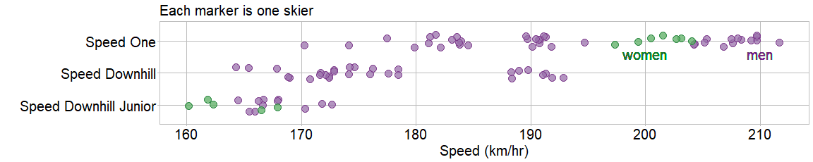<!-- --> .pull-left[ <table class="table" style="font-size: 18px; float: left; margin-right: 10px;"> <thead><tr><th style="border-bottom:hidden;padding-bottom:0; padding-left:3px;padding-right:3px;text-align: center; " colspan="2"><div style="border-bottom: 1px solid #ddd; padding-bottom: 5px; ">Variables</div></th></tr></thead> <tbody> <tr> <td style="text-align:left;background-color: white !important;"> speed </td> <td style="text-align:left;background-color: white !important;"> quantitative </td> </tr> <tr> <td style="text-align:left;background-color: white !important;"> event </td> <td style="text-align:left;background-color: white !important;"> categorical, nominal, 3 levels </td> </tr> <tr> <td style="text-align:left;background-color: white !important;"> sex </td> <td style="text-align:left;background-color: white !important;"> categorical, nominal, 2 levels </td> </tr> </tbody> </table> ] .pull-right[ - Direct labeling eliminates the legend - Colors safe for color-vision-deficient viewers ] <div class="my-footer"> <span>Data source: 2011 World speed skiing competition, in the <a href="https://CRAN.R-project.org/package=GDAdata">GDAdata</a> R package</span> </div> --- class: left # Box and whisker chart Designed to summarize the distribution of a single quantitative variable. <br> <!-- --> <br> .pull-left[ <table class="table" style="font-size: 18px; float: left; margin-right: 10px;"> <thead><tr><th style="border-bottom:hidden;padding-bottom:0; padding-left:3px;padding-right:3px;text-align: center; " colspan="2"><div style="border-bottom: 1px solid #ddd; padding-bottom: 5px; ">Variables</div></th></tr></thead> <tbody> <tr> <td style="text-align:left;background-color: white !important;"> years </td> <td style="text-align:left;background-color: white !important;"> quantitative </td> </tr> </tbody> </table> ] .pull-right[ - Shows a 5-point summary of distributions - Useful when too much data for a strip chart ] <div class="my-footer"> <span>Data source: MIDFIELD subset from the <a href="https://github.com/graphdr/graphclassmate">graphclassmate</a> R package</span> </div> --- class: left # Box and whisker chart Subset by a category and distinguish levels by row. <br> 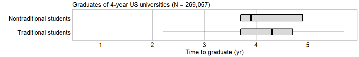<!-- --> <br> .pull-left[ <table class="table" style="font-size: 18px; float: left; margin-right: 10px;"> <thead><tr><th style="border-bottom:hidden;padding-bottom:0; padding-left:3px;padding-right:3px;text-align: center; " colspan="2"><div style="border-bottom: 1px solid #ddd; padding-bottom: 5px; ">Variables</div></th></tr></thead> <tbody> <tr> <td style="text-align:left;background-color: white !important;"> years </td> <td style="text-align:left;background-color: white !important;"> quantitative </td> </tr> <tr> <td style="text-align:left;background-color: white !important;"> group </td> <td style="text-align:left;background-color: white !important;"> categorical, nominal, 2 levels </td> </tr> </tbody> </table> ] .pull-right[ - Convention "up" is "better", so row medians decrease from bottom to top - Outliers omitted ] <div class="my-footer"> <span>Data source: MIDFIELD subset from the <a href="https://github.com/graphdr/graphclassmate">graphclassmate</a> R package</span> </div> --- class: left # Box and whisker chart Merge two categories (path and sex) into a new "Group" category <br> 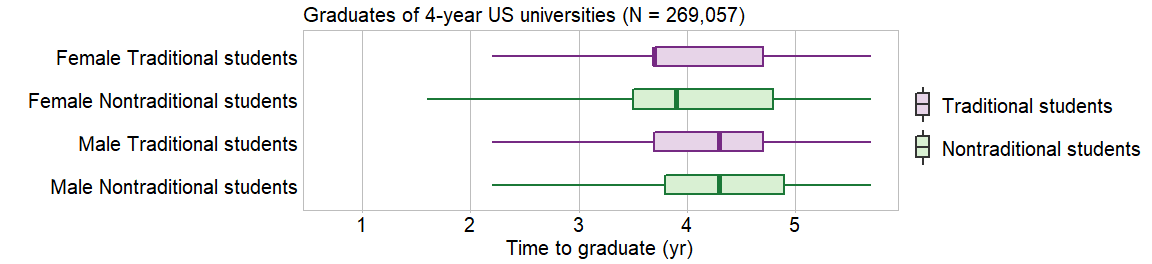<!-- --> <br> .pull-left[ <table class="table" style="font-size: 18px; float: left; margin-right: 10px;"> <thead><tr><th style="border-bottom:hidden;padding-bottom:0; padding-left:3px;padding-right:3px;text-align: center; " colspan="2"><div style="border-bottom: 1px solid #ddd; padding-bottom: 5px; ">Variables</div></th></tr></thead> <tbody> <tr> <td style="text-align:left;background-color: white !important;"> years </td> <td style="text-align:left;background-color: white !important;"> quantitative </td> </tr> <tr> <td style="text-align:left;background-color: white !important;"> group </td> <td style="text-align:left;background-color: white !important;"> categorical, nominal, 4 levels </td> </tr> <tr> <td style="text-align:left;background-color: white !important;"> path </td> <td style="text-align:left;background-color: white !important;"> categorical, nominal, 2 levels </td> </tr> </tbody> </table> ] .pull-right[ - Direct comparison easier without facets - Color encodes the "path" category ] <div class="my-footer"> <span>Data source: MIDFIELD subset from the <a href="https://github.com/graphdr/graphclassmate">graphclassmate</a> R package</span> </div> --- class:inverse, center, middle # Summary ## Chart design and rhetorical considerations --- class: left # Chart design .pull-left[ **Chart selection** - What are your variables, by name? - Is a variable quantitative or categorical? - Is a categorical variable naturally ordered (ordinal) or not (nominal)? - Starting with a small number of variables, what chart types match the data structure? - How does the chart type change as you add new variables? ] .pull-right[ **Chart aesthetics** - Superposed designs work best with small numbers of subsets or when the subsets visually cluster. - Faceted designs permit a greater number of subsets to be compared. - Deliberately assign the size, shape, and color of every visual element. - Use color deliberately. Choose colors that are safe for color-vision-deficient viewers. ] --- class: left # Rhetorical considerations .pull-left[ **Audience and message** - What is your story? - Does the visual evidence directly support your verbal argument? - Have you placed the story in context visually? - Who is your audience? - Will the audience resist your conventions? - If so, is overcoming audience resistance worth the effort? ] .pull-right[ **Ethics of visual rhetoric** - Is your design equitable and inclusive? - Are you seeing only what you want to see? What the audience wants to see? - All there alternative explanations for what the chart shows? - Are your data dubious? Insufficient? - Have you concealed information? Concealed a large uncertainty? - Does your chart suggest misleading patterns? ] --- class:inverse, center, middle # Appendix ## When you have more variables --- class: left # When you have more variables, look for appropriate designs ### Our examples have used a limited number of variables - 2 quantitative variables or less - 3 categorical variables or less ### Expanding your multivariate graphical repertoire - scatterplot matrix - co-plot - open-high-low-close (OHLC) chart - parallel coordinate chart - survey stacked-bar chart --- class: left # Scatterplot matrix A grid of scatterplots showing the bivariate relationships between all pairs of variables. .pull-left[ Designed for datasets with a large number of quantitative variables. Density plots (one per variable) on the diagonal. Pearson correlation coefficients for each pair in the upper triangle. Example: banknote dimensions, 100 each genuine and counterfeit - 6 quantities - 1 category ] .pull-right[ <img src="img/scatterplot-matrix-example.png" style="height:425px"> ] <div class="my-footer"> <span> Data source: <em>bank</em> dataset included with the <a href="https://CRAN.R-project.org/package=gclus">gclus</a> R package </span> </div> --- class: left # Conditioning plot (co-plot) A grid of scatterplots of two quantities that depend on ranges of one or two additional quantities. .pull-left[ Designed for datasets with 3 or 4 quantitative variables. The ranges of the conditioning variables are shown in panels adjacent to the main grid. Example: air quality measurements - 4 quantities ] .pull-right[ <img src="img/conditioning-plot-example.png" style="height:425px"> ] <div class="my-footer"> <span> Data source: <em>airquality</em> dataset included in the <a href="https://cran.r-project.org/">base R</a> installation </span> </div> --- class: left # Open-high-low-close (OHLC) chart Time series of market prices. .left-column[ Color can indicate levels of a category: - close > open (green) - close < open (red) Example - 4 quantities - 2 categories ] .right-column[ <img src="img/financial-ohlc-example.png" style="height:425px"> ] <div class="my-footer"> <span> Image from: <a href="https://datavizcatalogue.com/methods/OHLC_chart.html"> The data visualization Decalogue</a > </span> </div> --- class: left # Parallel coordinate chart Each variable has its own vertical axis (usually scaled min to max). Each observation is a line. .left-column[ Designed for datasets with a large number of quantitative variables. Example: banknote dimensions, 100 each genuine and counterfeit - 6 quantities - 1 category ] .right-column[ <img src="img/parallel-coord-example.png"> ] <div class="my-footer"> <span> Data source: <em>bank</em> dataset included with the <a href="https://CRAN.R-project.org/package=gclus">gclus</a> R package </span> </div> --- class: left # Survey stacked-bar chart Compare responses to Likert-style survey questions. Each bar shows 100% of responses to a question. .pull-left[ Colored segments represent percentage shares for the category levels: Strongly Disagree, Disagree, Neutral, Agree, Strongly Agree. Three approaches, each with their own advantages. - diverging - diverging with separate neutral - 100% stacked bars Data - 2 categories (questions, responses) - 1 quantity (percent share) ] .pull-right[ <img src="img/likert-example-1.png" style="height:130px"> <img src="img/likert-example-2.png" style="height:130px"> <img src="img/likert-example-3.png" style="height:130px"> ] <div class="my-footer"> <span> Images from: Lisa Charlotte Muth and Gregor Aisch (2018) <a href="https://blog.datawrapper.de/divergingbars/"> The case against diverging stacked bars</a> Data wrapper blog. </span> </div> --- class:inverse, center, middle